
Introduction to Website Design
Website design encapsulates the process of creating visually appealing and user-friendly websites. It combines various elements such as layout, color schemes, graphics, fonts, and content to construct a cohesive and functional online presence. The primary purpose of website design is not only to attract visitors but also to provide an intuitive and engaging user experience that encourages interactions and conversions. In today’s digital landscape, a well-designed website is indispensable for both businesses and individuals aiming to establish a credible and authoritative online presence.
The importance of website design has magnified significantly over the years, influenced by evolving technology and changing user preferences. Initially, websites were straightforward and text-heavy, focusing primarily on disseminating information. However, as the internet became more accessible and competitive, the visual and interactive aspects of website design gained prominence. Modern website design emphasizes responsiveness, accessibility, and interactivity to meet the diverse needs of users accessing websites from various devices and platforms.
Additionally, the evolution of website design has had a profound impact on user experience and business growth. A well-designed website can enhance user engagement by providing a seamless and enjoyable browsing experience. This, in turn, can lead to higher conversion rates, customer retention, and brand loyalty. For businesses, an effective website design can differentiate them from competitors, establish trust with potential customers, and drive sales and revenue growth. As such, understanding and implementing best practices in website design is crucial for achieving online success.
Overall, website design is a dynamic and ever-evolving field that plays a critical role in shaping the digital experiences of users and the success of online ventures. By staying abreast of the latest principles, trends, and best practices, web designers can create impactful and memorable websites that resonate with their target audience.
Key Principles of Effective Website Design
Effective website design is grounded in a set of fundamental principles that ensure both functionality and aesthetic appeal. One of the core principles is simplicity. A clean, uncluttered design enhances user experience by making navigation straightforward and intuitive. Visual elements should be used purposefully, avoiding overwhelming users with excessive information or graphics. Minimalistic designs, characterized by ample white space and limited color palettes, are often more effective in conveying a clear message.
Consistency is another vital principle in website design. Consistent use of fonts, colors, and layout elements across all pages helps create a cohesive look and feel, which in turn fosters a more professional and trustworthy appearance. This uniformity aids in building brand identity and makes it easier for users to navigate the site without confusion.
Responsive design is essential in today’s multi-device world. Ensuring that a website is accessible and functional on various devices, from desktops to smartphones, is non-negotiable. Responsive design involves fluid grids, flexible images, and media queries to adjust the layout to the screen size. This adaptability not only enhances user experience but also positively impacts search engine rankings.
Accessibility is a principle that ensures your website is usable by all people, including those with disabilities. Techniques such as providing text alternatives for non-text content, ensuring sufficient color contrast, and enabling keyboard navigation play a crucial role in making a website accessible. Adhering to Web Content Accessibility Guidelines (WCAG) is recommended to meet accessibility standards.
Finally, user-centric design focuses on the needs and preferences of the end user. Conducting user research, creating user personas, and employing usability testing are strategies that can inform design decisions. The ultimate goal is to create a website that is intuitive, easy to navigate, and meets the user’s needs effectively. User-centric design often involves simplifying the user journey and ensuring that the most important information is easily accessible.
By adhering to these key principles—simplicity, consistency, responsive design, accessibility, and user-centric design—you can create a website that is both visually appealing and highly functional, ensuring a positive experience for all users.
Current Trends in Website Design
Website design is an ever-evolving field, continuously shaped by new technologies, user preferences, and aesthetic innovations. Among the most notable current trends is the rise of minimalistic design. This approach emphasizes simplicity, using clean lines, ample white space, and straightforward navigation to create an uncluttered, user-friendly interface. By focusing on essential elements, minimalistic design enhances user experience by reducing distractions and making it easier for visitors to find the information they need.
Bold typography and vibrant colors are also gaining traction in contemporary website design. Large, expressive fonts can convey a brand’s personality and improve readability, while vibrant color palettes can capture attention and elicit emotional responses. When combined thoughtfully, these elements can create a visually striking and memorable user experience.
Another significant trend is the integration of animation and micro-interactions. These subtle, interactive elements add a layer of sophistication and engagement to a website. From hover effects to loading animations, micro-interactions can guide users through a site, provide instant feedback, and enhance overall interactivity. They make the browsing experience more dynamic and engaging, which can lead to increased user satisfaction and retention.
The growing importance of mobile-first design cannot be overstated. With the majority of internet users accessing websites via mobile devices, designing with a mobile-first approach ensures that sites are fully responsive and optimized for smaller screens. This involves prioritizing mobile usability, such as touch-friendly navigation, quick loading times, and content that scales seamlessly across different devices. By focusing on mobile-first design, businesses can reach a broader audience and provide a consistent user experience across all platforms.
These trends are not just about following the latest fads; they are about enhancing user engagement and improving overall website performance. By embracing minimalistic design, bold typography, vibrant colors, animation, and mobile-first design, businesses can create websites that are not only visually appealing but also highly functional and user-centric.
The Role of User Experience (UX) in Website Design
User Experience (UX) is a fundamental aspect of website design, encompassing the overall interaction and satisfaction a user has while navigating a site. At its core, UX is about creating a seamless, intuitive, and enjoyable experience for users, ensuring that they can find what they need quickly and efficiently. The importance of UX in website design cannot be overstated, as it directly impacts user engagement, conversion rates, and overall site success.
Key UX elements include navigation, load times, accessibility, and content structure. Effective navigation is critical; it should be intuitive and well-organized, allowing users to effortlessly move through the site. Slow load times can deter users, making it essential to optimize your website for speed. Accessibility ensures that all users, including those with disabilities, can access and use your site effectively. A well-structured content layout helps users easily locate and absorb information, enhancing their overall experience.
User research and usability testing are integral to understanding and improving UX. By conducting user research, designers can gather valuable insights into user behaviors, needs, and pain points. This data is vital for making informed design decisions that cater to the target audience. Usability testing involves evaluating the website with real users to identify any usability issues and areas for improvement. This iterative process helps to refine the design, ensuring that it meets user expectations and provides a positive experience.
Continuous improvement based on user feedback is essential for maintaining a high-quality UX. By regularly collecting and analyzing user feedback, designers can identify emerging issues and trends, allowing them to make necessary adjustments and enhancements. This proactive approach ensures that the website remains user-centric, adaptive, and relevant in an ever-evolving digital landscape.
Essential Tools and Software for Website Design
In the ever-evolving field of website design, utilizing the right tools and software can significantly enhance productivity and the quality of the final product. Graphic design tools like Adobe Photoshop and Illustrator are indispensable for creating and editing visual elements. Adobe Photoshop is renowned for its robust photo-editing capabilities, allowing designers to manipulate images with precision. Meanwhile, Adobe Illustrator excels in vector graphics, making it ideal for logo design and scalable illustrations.
Website builders such as WordPress and Wix offer versatile platforms for creating websites without extensive coding knowledge. WordPress, a highly customizable and popular content management system (CMS), is favored for its vast array of plugins and themes. On the other hand, Wix provides an intuitive drag-and-drop interface, allowing designers to craft visually appealing sites quickly.
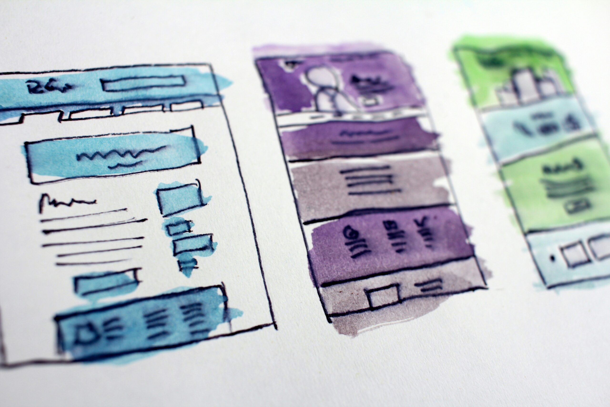
Prototyping tools, including Sketch and Figma, are essential for wireframing and designing user interfaces. Sketch, primarily used on macOS, is loved for its simplicity and powerful vector editing tools. Figma, a cloud-based design tool, promotes collaboration by enabling multiple designers to work on a project simultaneously. Its real-time feedback feature streamlines the design process and facilitates efficient teamwork.
Coding tools like Sublime Text and Visual Studio Code cater to developers who require advanced text editors for writing clean and efficient code. Sublime Text is known for its speed, customizable interface, and powerful shortcuts. Visual Studio Code, developed by Microsoft, offers a user-friendly interface and extensive support for extensions, making it versatile for various programming languages and frameworks.
Choosing the right tools depends on the specific needs of a project. For instance, a project focused on high-quality visual content might prioritize Adobe Creative Cloud products, while a project requiring rapid development and deployment may benefit from a comprehensive website builder. Evaluating project requirements and testing various tools can help designers make informed decisions, ensuring the chosen tools align with the project’s goals and enhance overall efficiency.
SEO-friendly website design is integral to ensuring your site ranks well on search engine results pages (SERPs). Implementing best practices for SEO from the ground up can significantly enhance visibility and user experience. One of the foundational elements is mobile optimization. With a growing number of users accessing websites via mobile devices, ensuring your site is responsive and mobile-friendly is crucial. Google’s mobile-first indexing means that a mobile-optimized site is not just beneficial but necessary.
Fast load times are another key factor in both user experience and SEO. Slow-loading websites can frustrate users and lead to higher bounce rates, negatively impacting your search rankings. Techniques such as image optimization, leveraging browser caching, and minimizing JavaScript can contribute to faster load times. Clean code is equally important; it ensures that search engine bots can easily crawl and index your website, leading to better rankings.
Keyword integration remains a cornerstone of SEO. Effectively incorporating relevant keywords into your site’s content, meta tags, and URLs can improve search engine visibility. However, it’s crucial to avoid keyword stuffing. Instead, focus on natural, relevant use of keywords throughout your content. Creating high-quality content that provides value to the user will naturally lead to better engagement and higher rankings.
Technical SEO aspects cannot be overlooked. XML sitemaps, for instance, help search engines understand the structure of your website and find new pages more quickly. Meta tags, including title tags and meta descriptions, provide essential information to search engines and can improve click-through rates. Structured data, such as schema markup, helps search engines better understand your content, leading to enhanced SERP features like rich snippets.
In conclusion, by adhering to these best practices—focusing on mobile optimization, ensuring fast load times, maintaining clean code, integrating keywords naturally, and addressing technical SEO elements—you can create a website that not only meets the needs of your audience but also performs well in search engine rankings.
Case Studies: Successful Website Designs
To comprehend the principles, trends, and best practices in website design, it is crucial to examine real-world examples that have successfully implemented these elements. This section delves into a series of case studies that highlight various aspects of exceptional website design, demonstrating practical applications and their positive impacts on businesses and organizations.
First, let’s consider the website design of Airbnb. Airbnb’s innovative layout emphasizes simplicity and user-friendliness. The homepage features high-quality images and minimal text, providing a visually appealing and intuitive user experience. The search functionality is prominently placed, ensuring that users can quickly find accommodations. This design has significantly enhanced user engagement and contributed to Airbnb’s global success.
Another notable example is Apple. Apple’s website is a prime example of exceptional user experience (UX) design. The site is clean, with ample white space and intuitive navigation, allowing users to find products and information effortlessly. The effective use of multimedia, such as high-resolution images and videos, showcases products in a visually compelling manner. This design approach has bolstered Apple’s brand perception and streamlined the user journey from product discovery to purchase.
Dropbox offers an excellent case of effective use of multimedia and storytelling. The website employs animations and illustrations to explain complex concepts in a simple and engaging way. This approach not only enhances the user’s understanding of Dropbox’s services but also makes the website memorable. The design’s clarity and creativity have significantly contributed to customer retention and brand loyalty.
Lastly, Slack demonstrates the power of a well-executed visual hierarchy. The website uses bold typography and vibrant colors to guide users’ attention to key information and calls to action. This clear visual hierarchy simplifies navigation and enhances the overall user experience, making it easier for users to understand Slack’s value proposition. This has been a critical factor in Slack’s rapid growth and widespread adoption.
These case studies illustrate that successful website designs are a blend of innovative layouts, exceptional UX, and effective multimedia use. By studying these examples, designers and businesses can gain valuable insights into creating websites that not only look good but also drive significant business results.
Future Trends and Predictions in Website Design
The future of website design is poised to undergo transformative changes driven by rapid technological advancements. One of the most significant influences is the integration of artificial intelligence (AI) and machine learning (ML) into the design process. AI-powered tools are already enabling designers to create more personalized and user-centric websites by analyzing user behavior and preferences. These technologies can automate repetitive tasks, offer design suggestions, and even assist in real-time problem-solving, thus enhancing efficiency and creativity.
Another emerging trend is the growth of voice user interfaces (VUI). As smart speakers and voice-activated devices become increasingly popular, users are transitioning from traditional text-based searches to voice commands. This shift necessitates the design of websites that are optimized for voice search and can support conversational interactions. Designers will need to focus on creating intuitive VUI that provide seamless and natural user experiences.
Augmented reality (AR) and virtual reality (VR) are also set to revolutionize web design. These immersive technologies offer novel ways to engage users by blending the digital and physical worlds. AR can enhance the user experience by overlaying digital information onto the real world, while VR can transport users to entirely virtual environments. Incorporating AR and VR into website design can create interactive and memorable experiences that captivate users.
To stay ahead in this rapidly evolving field, designers must commit to continuous learning and innovation. Keeping abreast of the latest trends and technological advancements is crucial. Participating in industry conferences, online courses, and professional forums can provide valuable insights and networking opportunities. Additionally, experimenting with new tools and techniques can foster innovation and help designers refine their craft.
In this dynamic landscape, adaptability and a forward-thinking mindset are essential. By embracing emerging technologies and staying informed about industry trends, designers can create cutting-edge websites that not only meet current user needs but also anticipate future demands.